Design
Emotion Board
An interactive installation that invites students to share how they feel in color during a stressful stretch of the semester, designed from maps of foot traffic and mood on Krentzman Quad.
- Role
- Design coursework
- When
- Spring 2025
- With
- Robbie Del Presto, Dafne D'Olimpio, Nimi Shoyinka
- Methods
- Field observation
- Mapping
- Installation
- Iteration
Goals
The main idea for this project was to give students a chance to express their emotions through art during a stressful period. We wanted:
- 10 to 20 people to interact within an hour.
- To give people a creative outlet to express themselves.
- Students to feel a sense of community by sharing their emotions on paper, seeing how others are feeling, and knowing they're not alone.
We also wanted to grow our knowledge of interactive design and create a meaningful experience without explicit instructions.
Mapping Krentzman Quad
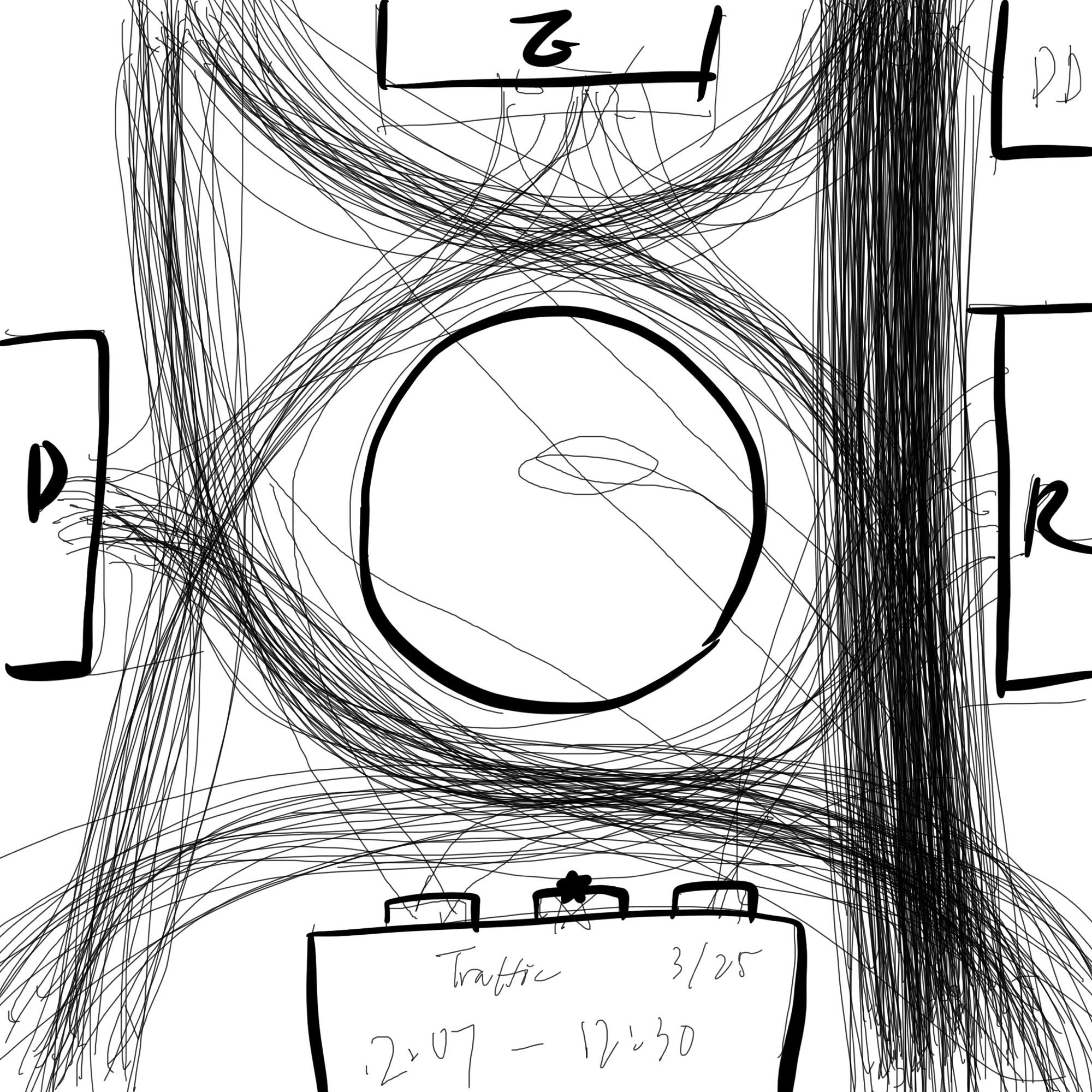
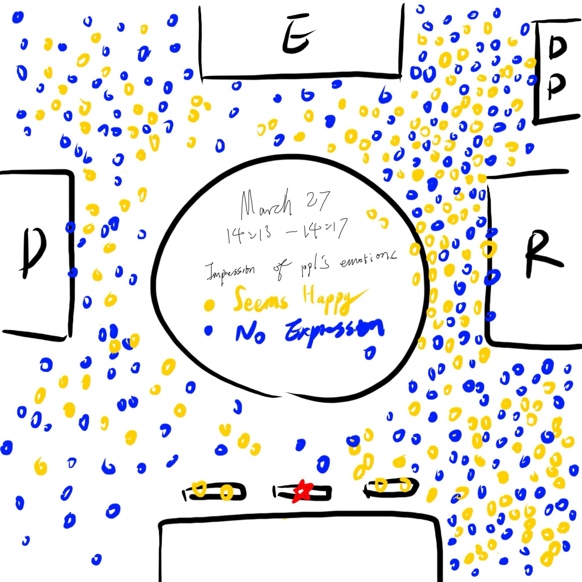
Before building anything, we mapped Krentzman Quadrangle twice: once for its traffic, and once for the emotions of the people in it. First, we wanted our project to catch people's attention. The quad is big, and the flow of people was uneven across it, so we wanted to set our project in its most prominent part. Second, since our project is about emotions, we wanted to record the emotions of the passers-by too.
The traffic map shows students and everyone else walking through Krentzman, going in and out of buildings and on to other parts of campus. The most popular part of the quad is the path between Richards Hall and the center. It carries significantly more people than the other paths, and other clubs usually set up their stalls around there.
For the emotions map, whenever a new person passed by the circle, we recorded whether they seemed happy. If they had a smile on their face or were energetically talking to their friends, we marked them yellow. If we couldn't tell their emotions, or they didn't seem happy, we marked them blue. The path between Dodge Hall and Mass Ave. seemed to be the moodiest part of the circle, and most of the happy pedestrians were with someone and talking.
We were telling the stories of people passing through the quad, but really we were only guessing their stories from the surface, especially for people with no expression. A neutral expression often doesn't mean a person feels nothing; most of the time they're keeping those emotions from being revealed. That's what our project was meant to do: let students tell their true stories despite the emotionless disguise.
First iteration
Based on our observations, the path between Krentzman Quad and Richards Hall had the most traffic, so we planned to set up there. Our original idea was a jar on a table with beads in different colors, each color tied to an emotion, so students could express how they felt by dropping beads into the jar.
For the first test, we laid a piece of gridded paper flat on the picnic table beside Dunkin' and Krentzman, with emojis and pencils in different colors. Each color matched an emotion, and we wanted people to fill in the grid with the color of their current emotion.
Few people noticed it, and no one interacted. We asked friends to draw on the board to catch people's attention, but that didn't work either.
"Honestly your board looked like someone's art project so we didn't really want to touch it."
Second iteration
Based on feedback in class, we changed the location, the audience and the setup.
- Location
- From Krentzman Quad (39°F, windy and chaotic) to After Hours by Starbucks, an indoor space that was calm and quiet.
- Setup
- From a flat table, where busy stairs backed people up on the way to class, to an easel along a quieter path, with markers in cups and an emoji taped to each.
- Emojis and color
- We fixed four problems from the first round: colors that weren't diverse or vibrant enough, too few options, and the size of the emojis.
Two of us set up the project and interacted with it to encourage others, then left. The other two watched from a table in the Starbucks and recorded everyone who walked up or joined in.
- people looked
- ~55
- went up and admired it
- 15
- interacted directly
- 10
We reached the lower end of our goal, but we still consider this iteration a success, especially compared with the first.
Why it worked: the action funnel
We used the action funnel's five preconditions for conscious action to understand what changed.
- Cue
- Signs that capture our attention. Ours was external: a white drawing pad with pops of color from the emojis.
- Reaction
- A decision that starts an action. Passers-by could choose to look at the drawing pad or not.
- Evaluation
- Weighing the pros and cons. Passers-by may think: do I have the time? Is this important? Will it benefit me?
- Ability
- Can people complete the action with what's available? We provided a drawing pad, markers, pens and sketches.
- Timing
- When will the action happen? Are passers-by in a hurry, running late, or between places?
What we'd change
The second iteration was much more successful than the first: a better location, more people interacting, and a better experience overall. But some students were confused by the emojis and didn't realize the colors were meant to describe their feelings.
"I chose purple because I like purple, I didn't really notice the emojis."
With another week, we would offer students a blank canvas and the freedom to draw whatever they wanted, giving them a creative way to express themselves during an academically charged period, and maybe to relieve some stress.